Contents
- Summary: Possible Combinations and Effects on Visualization
- Who to visualize?
- What to visualize?
- How to visualize?
- Examples
Intro
This page covers the functionality of the visualization suite of the JBDB and the different ways these visualizations can be generated. When entering this view, you will be presented with the following settings page:
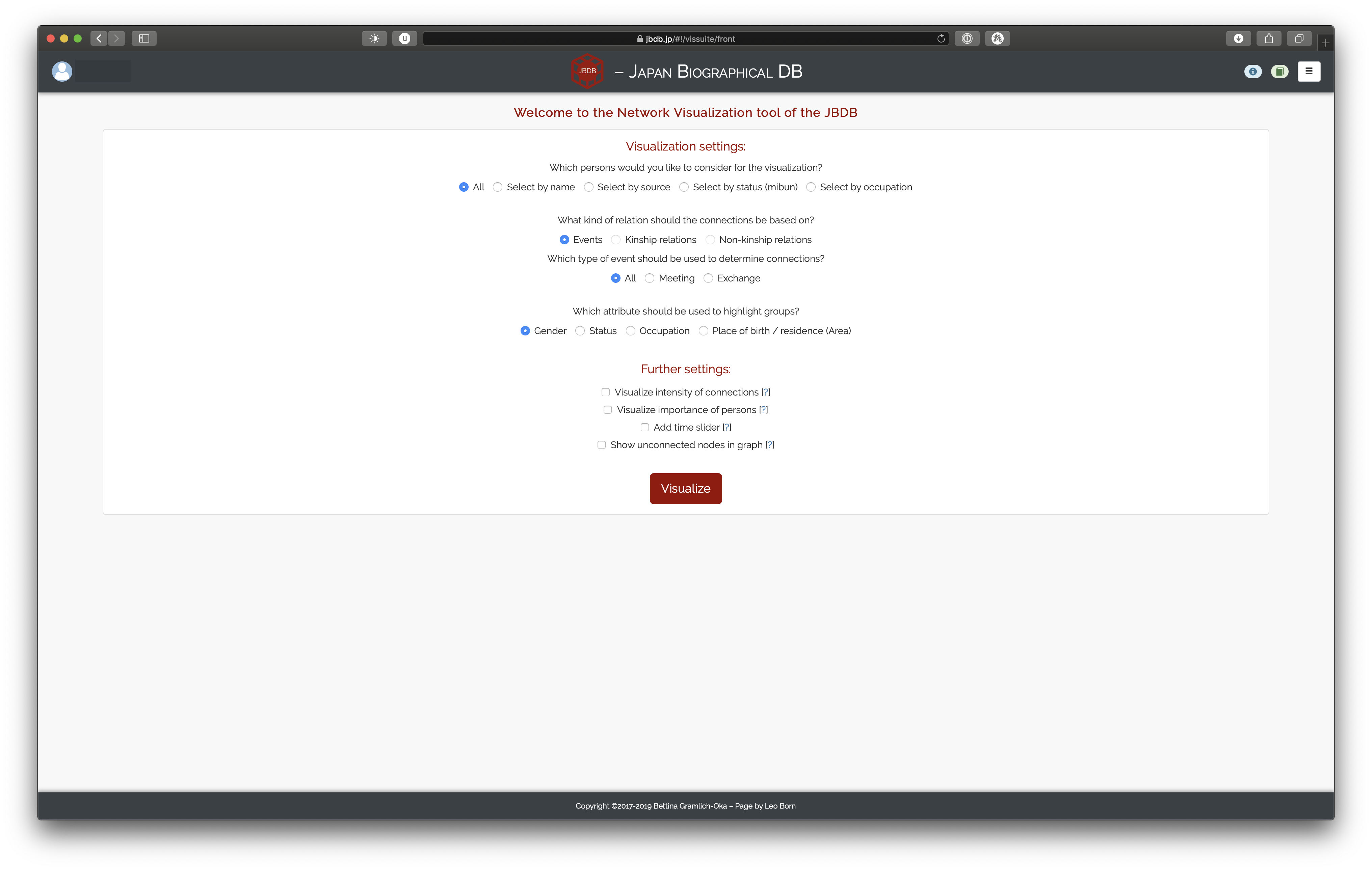
Broadly speaking, there are three important sections to the settings view: the first concerns the persons one is interested in visualizing (who to visualize?); the second is about what to base the visualizations on (what to visualize?); and the third is concerned with how the visualizations should look in the end (how to visualize?).
While this section is therefore structured in a way to reflect these three broad questions, for the impatient we will provide a brief summary of which settings can or cannot be combined with other settings first.
Summary: Possible Combinations and Effects on Visualization
For explanations of the visualization canvas, please refer to the other page.
- If “All” persons should be visualized, (non-)kinship relations can not be selected
- Any further setting, further source-specific setting, or further person-specific setting can not be selected for (non-)kinship relations
- If you “Select by name”, “Show unconnected nodes in graph” is disabled
- “Show unconnected nodes in graph” is incompatible with “Visualize importance of persons” and “Add time slider”
- Conversely, selecting “Visualize importance of persons” disables “Show unconnected nodes in graph”
- Conversely, selecting “Add time slider” disables “Show unconnected nodes in graph”
- “Add time slider” disables clustering in the visualization canvas
- “Visualize importance of persons” replaces the default degree slider in favor of a more fine-grained selection of centrality metrics in the settings menu of the visualization canvas
- Consequently, choosing this setting additionally shows centrality values for each person in the overlay window
Who to visualize?
The first settings section allows you to select the persons to base the visualizations on in five different ways:

Apart from the the “All” setting, which visualizes all persons in the JBDB, the other options work as follows: you select persons either directly (“Select by name”) or by source(s)/attribute; these seed persons are then used to find all other persons with whom they are connected, and this final set of persons will be visualized.
Going through each option individually, this should become clear.
Choosing “Select by name” displays a search bar and two boxes. By searching for persons, the left box will be filled with the matching results.1 You can now either select individual persons by clicking on them or move all found persons to the right box by clicking the right arrow symbol. You can de-select persons by either clicking on them in the right box or by clicking the left arrow symbol. They are then available in the left box again.
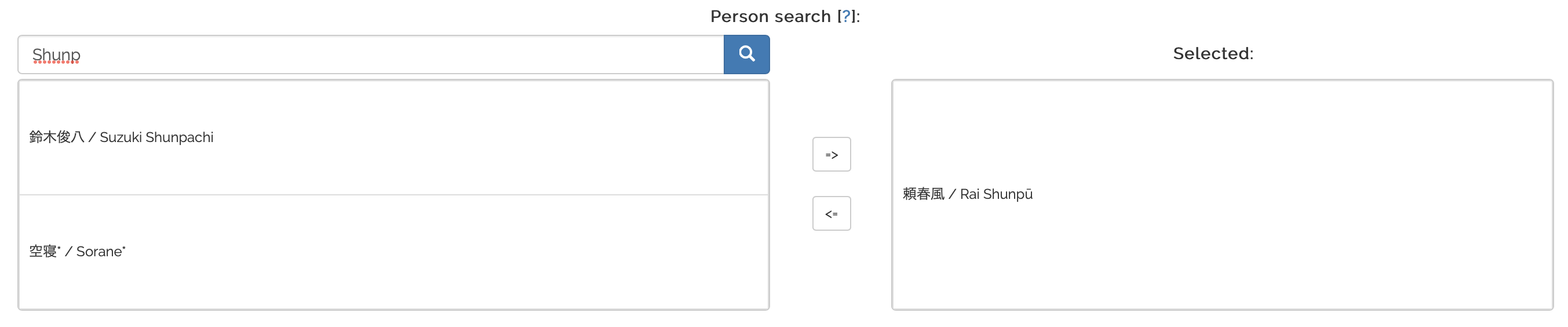
In our example, we would look for all connections Rai Shunpū has in the DB and get all the associated persons. The final visualization would include Rai Shunpū and all connected persons.
Choosing “Select by source”, “Select by status (mibun)”, or “Select by occupation” displays a dropdown from which you can select as many categories as you wish. The status dropdown shall serve as an illustrative example:
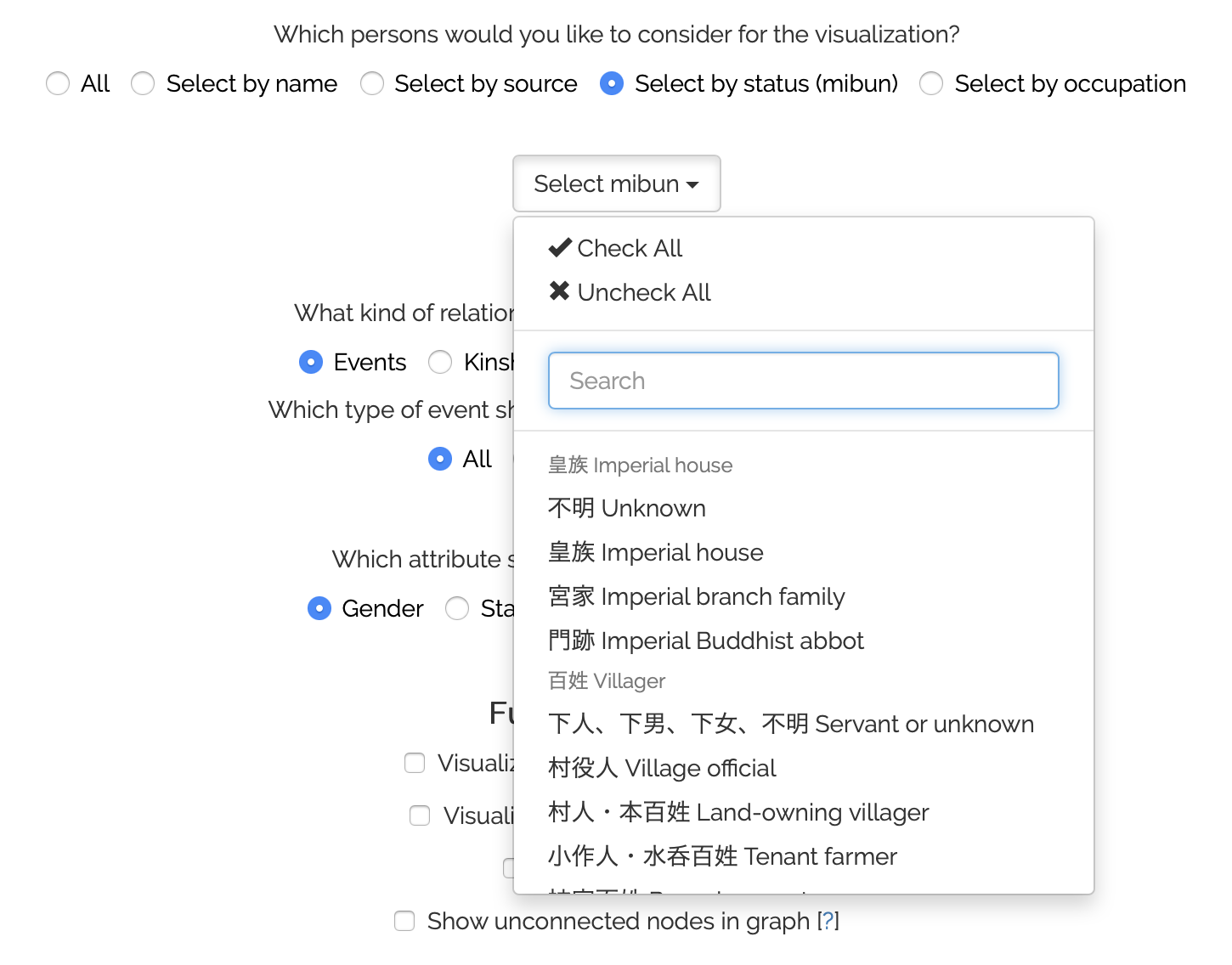
As you can see, you can quickly select or de-select all available categories at once, search for them, or simply manually select the categories of interest.
Using this dropdown results in a seed person set of all persons in the DB matching the chosen method. That is, if you select source(s), all persons for whom the selected source(s) were used are gathered; if you select status(es), all persons with the matching status(es) are gathered; and lastly, if you select occupation(s), all persons with the matching occupations(s) are gathered.
As above, starting from these gathered persons, all connected persons are extracted from the DB and thus the final visualization would include the gathered persons and their connected persons.2
What to visualize?
The next settings section is concerned with the underlying data that connections should be based on. For this, the section allows to select events, kinship, or non-kinship relations as the source of visualization:
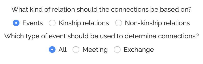
The app defaults to “Events”, for which you can further specify whether “All” event types should be considered, or only any event of the type “Meeting” or “Exchange”. In these cases, the app gets all events the seed persons were part of and further gathers all other non-seed persons who partook in these events. This way, you get e.g. all persons with whom Rai Shunpū interacted (if “All” is set) or all persons with whom he exchanged goods or correspondences (if “Exchange” is set).
If you select (non-)kinship relations to be the base of the visualization, the app gets all associated (non-)kinship relations for the seed persons and displays them in a tree-like hierarchical order. Note that (non-)kinship relations are not selectable if you set “All” in the who to visualize? section.
The finer selection works differently than for events. If you select (non-)kinship relations, you are presented with a slider as follows:
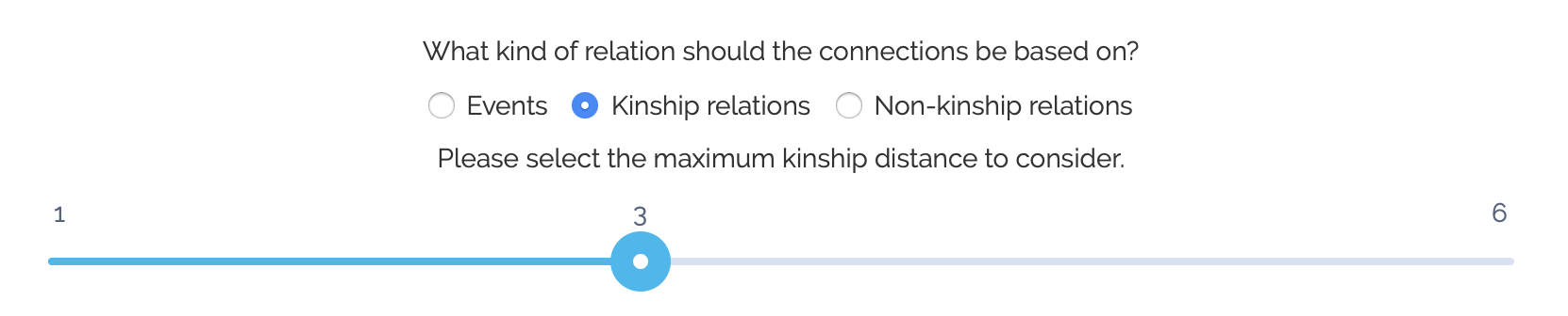
The slider allows you to set the maximal distance from the seed persons of related persons. 1 indicates that only people directly related to the seed persons are considered. For example, if we are interested in a family tree for Rai Shunsui, setting the distance to 1 would only include the persons with whom Rai Shunsui has kinship relations (as seen when displaying his information page).
However, setting the distance to 2 now also considers persons with whom the related people of Rai Shunsui are related, even if they are not directly related to him. Similarly, increasing the distance will widen the scope of the resulting visualization.3
Notes on some limitations
Note that for kinship relations, currently only relations spanning at most one level (e.g. sister, father, niece) are considered for the visualizations. Therefore, any relation spanning two or more levels (or generations), like grandfather of are not supported due to computational limitations in determining the position of the persons within the hierarchy.
Furthermore, there will only be displayed one relation between any two people in order to reduce clutter. If person A is the brother of person B, person B is automatically set to be the sibling (brother or sister) of person A as well (cf. note on complementary relations). However, displaying both relations would not benefit the expressivity of the resulting visualizations. Therefore, we drop one of the two relations (at random).
This also means that multiple different relations between any two people are also not considered. For example, if the niece N of some person P becomes the wife of said person P, we will ignore one of the two relations. While these relations are historically informed, they are currently too complex to handle in an efficient manner.
Additionally, implicit relations are not considered as well, i.e. if the database contains information that person C is the father of person D, D is the father of E, but does not contain explicit information that C is therefore the grandfather of E, the app does not attempt to induce this relation.
How to visualize?
After determining what to visualize, we can concentrate on some means of changing the way data is visualized. The first selection component is fairly simple and allows you to choose an attribute that is used to group the persons by:

Grouping results in persons with the same attribute to be shown in the same color (e.g. all artisans are red, all merchants are green etc.). The colors are generated randomly, so do not be surprised if the coloring of nodes changes even if the setting stays the same. Also note that if a person has an associated image, the node will not be colored but instead display the image.
The selected attribute further allows to show or hide these specific groups from the visualization in the visualization view. Therefore, if you select “Gender” you can choose to only display all female persons in a network, or if you select “Occupation”, you can choose to show all persons except scholars.
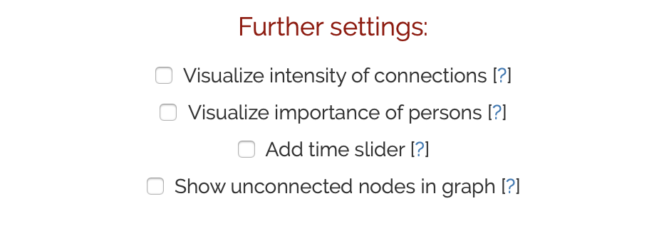
The next selection of settings are fairly intuitive as well. Note, however, that these settings are not available when you base your visualization on (non-)kinship relations:
Selecting “Visualize intensity of connections” thickens edges (i.e. connections) between two people. The more connections there are between any two persons compared to the other connections, the thicker the edge between these persons will be drawn.
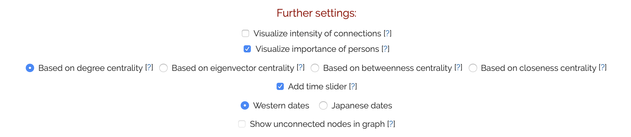
Selecting “Visualize importance of persons” does something similar depending on the total number of connections of any single person. Therefore, if person A has more conncetions than person B, person A will be shown larger. If you select this, you can choose one of four different algorithms to determine the size of any person. Please refer to the help boxes (indicated by the question mark next to each algorithm) for details.
The option “Add time slider” will add a temporal slider element to the visualization view. The dates considered for the slider are the first and last dates of the events used to determine the network. If you select this option, you can further choose wether Japanese or Western dates should be displayed.
Selecting the previous two options thus looks as follows:
The last additional setting that is available for all visualizations based on events is “Show unconnected nodes in graph”. This setting is available for all ways of selecting seed persons except “Select by name”. Therefore, if the seed persons are determined by a source you select, it could happen that some of the seed persons have no connection in the database. Per default, any person without connection is not shown in the visualization; however, if you expressly wish to display even those singleton persons, you can do so by enabling this option.
Note that this option is mutually exclusive with some of the above-mentioned three options:
- If you enable “Visualize importance of persons”, “Show unconnected nodes in graph” becomes disabled (and vice versa)
- If you set “Add time slider”, “Show unconnected nodes in graph” becomes disabled (and vice versa)
Seed person-specific settings
If you select seed persons by name or by source, additional settings specific to these selections become available. For “Select by name”, the additional setting becomes available if you select more than two persons:

Enabling this will discard persons not in the seed persons list. This is useful if you are only interested in the intra-network of the persons you selected.
For “Select by source”, the following options become available:
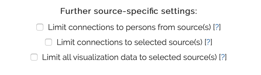
They are all mutually exclusive, therefore only one can be enabled at most. The first setting, “Limit connections to person from source(s)” works similar to the person-specific setting mentioned above. That is, enabling this will only show persons for whom the selected source(s) were set and will discard any connections to persons outside the seed persons list. With this setting, you could for example show only the interactions between all people who appear in the same source.
The second setting considers persons beyond the seed persons list again. This time, however, with the restriction that the underlying events for every connection must come from the source(s) you specified. For example, if you select a diary as the source and enable this setting, it visualizes the interactions described in the diary – between all persons for whom the diary was set as the source (= seed persons) as well as people connected to the seed persons, even if the source was not used to create entries for the the other, non-seed persons.
Lastly, the third setting combines the above two mechanisms. This is the most strict one as the resulting network only shows:
- People for whom the selected source(s) was/were used to create the entry (= seed persons)
- Connections that are based only on the selected source(s)
Therefore, if you again select a diary for example, the network will show all persons whose biographical information comes from the diary and the connections between those persons will also only be based on interactions described in the diary.
Examples (as of May 2021)
This section presents screenshots of networks resulting from different settings combinations. If you are interested in how to interact with the networks and see what you can do with them, please refer to the visualization view page.
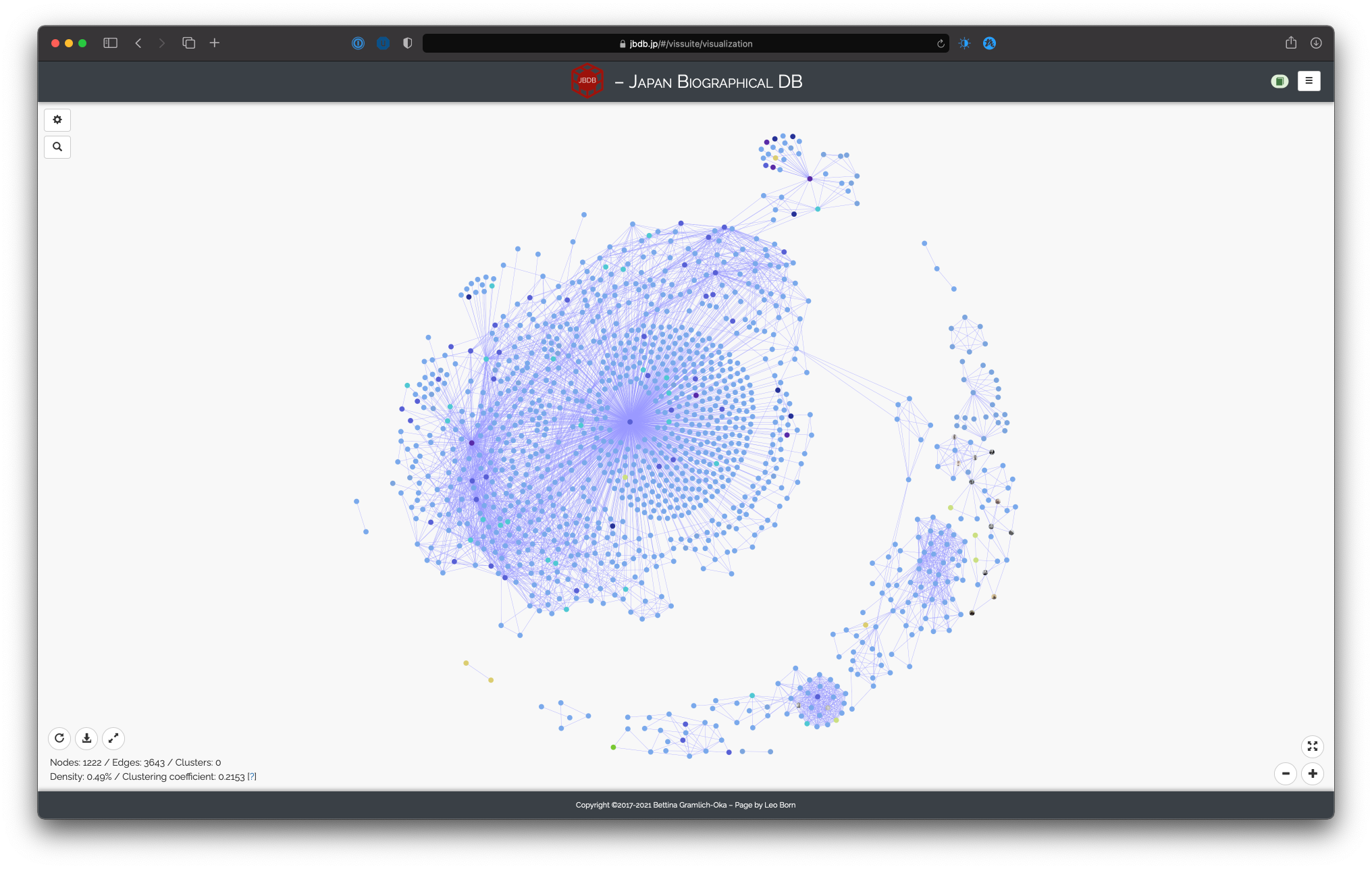
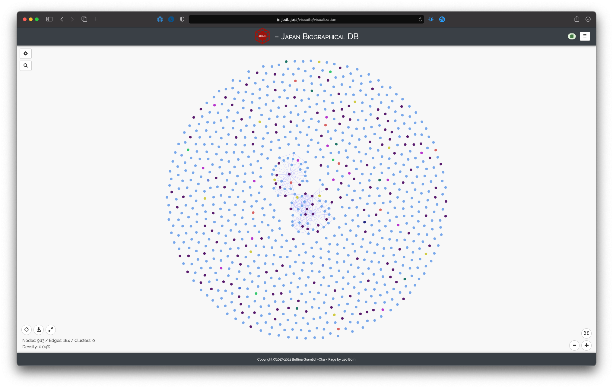
All persons, based on all events, group highlighting by occupation
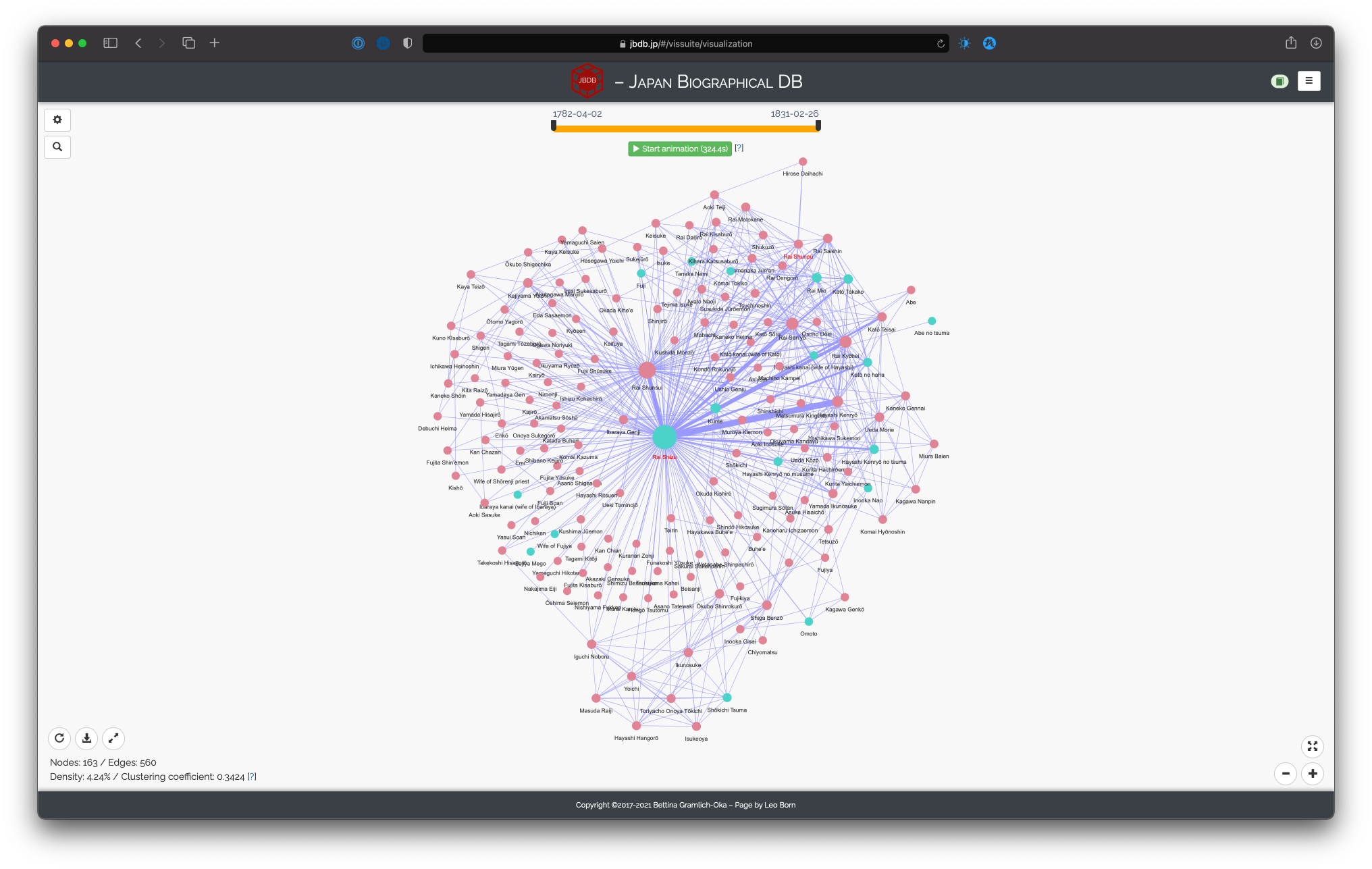
Network of Rai Shunpū and Rai Shizu, based on meetings, group highlighting by gender, intensity of connections, importance of persons (degree centrality), time slider
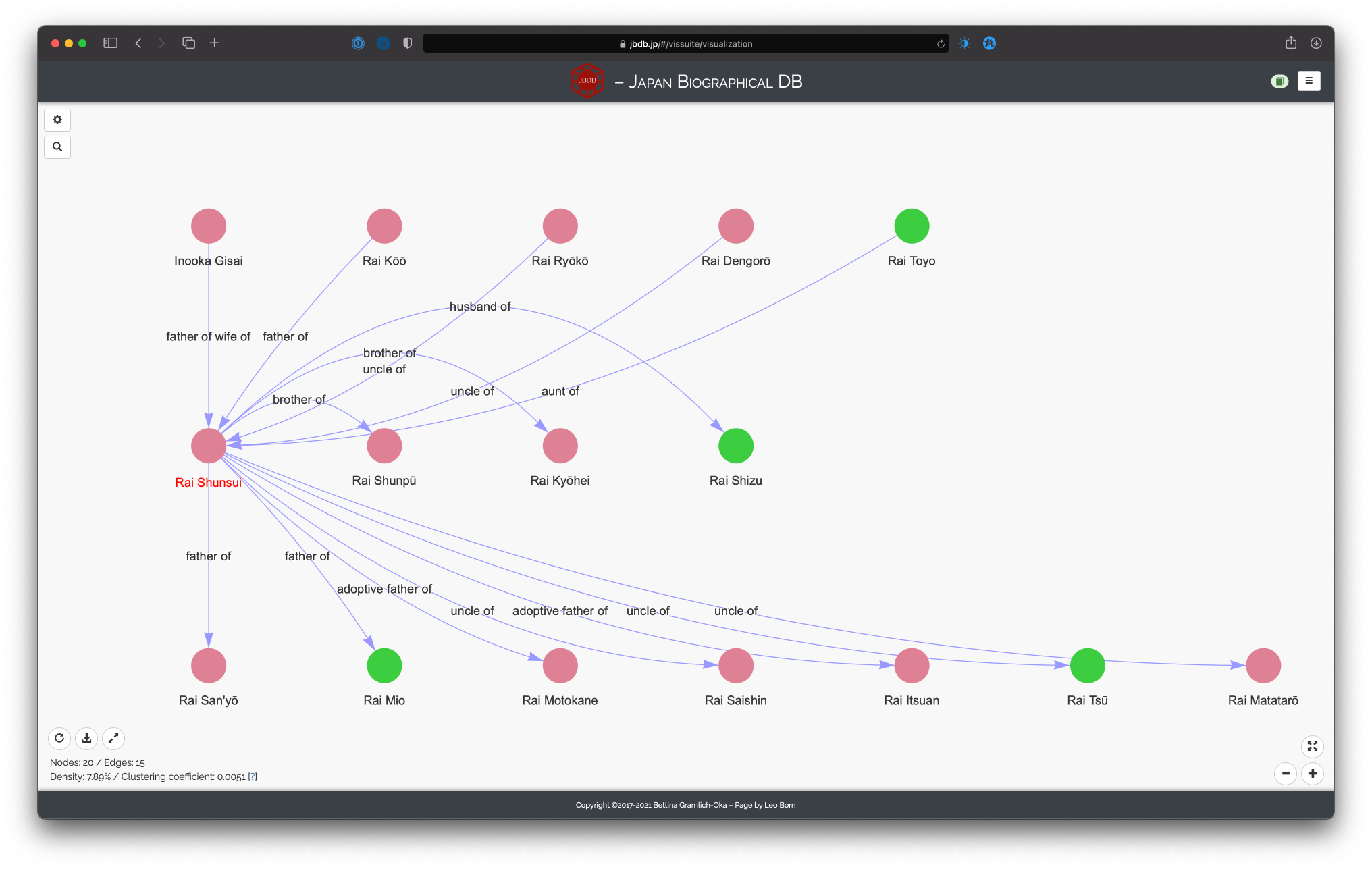
Network of Rai Shunsui, based on kinship relations, maximal distance 1, group highlighting by gender
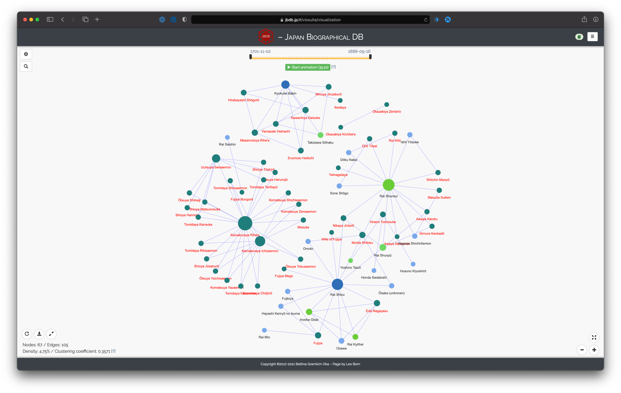
Network of merchants, based on all events, group highlighting by occupation, importance of persons, time slider
Network of people from source “諸家人名江戸方角分”, based on all events, group highlighting by status, show unconnected nodes
1. This search also accounts for alternative names. As in the persons view, they will be marked with an asterisk (*).↩
2. Be aware, however, that if a person from the seed person list does not have any connections in the DB, it will not be shown in the visualization per default. If you wish to include all such “isolated” persons in the visualizations as well, you must explicitly set the option “Show unconnected nodes in graph” (see the section on how to visualize).↩